

Helsingin Sanomat needed a fresh identity to stay relevant – and the answer was hiding in plain sight, the logo. By blending heritage with new perspectives, the design gave people the joy of discovering familiar shapes in new contexts. It kept the brand instantly recognisable and empowered it to connect with its audience in meaningful ways across platforms.
Starting point
Founded in 1889, Helsingin Sanomat is Finland’s most trusted news source. With over a centery of history, it remains a cultural institution, but even the most iconic brands must evolve to stay relevant in a changing world.
CHALLENGE
By 2024, Helsingin Sanomat faced a need for a cohesive and refreshed visual identity. While its campaigns were impactul, the brand lacked continuity, making it harder to convey a unified presence across its platforms and touchpoints.
Solution
The answer lay in its heritage. By leveraging the iconic logo, Helsingin Sanomat created a flexible design system that honored its legacy while offering fresh perspectives. it gave people the joy of discovering familiar shapes in new contexts, making the brand both recognizable and modern. The new visual identity became a powerful tool to communicate its values effectively.
Execution
The identity was brought to life across outdoor advertising, digital platforms, print campaigns, social media, and even Helsinki’s iconic trams. Every application was unified by the logo’s versatile design, highlighting Helsingin Sanomat’s core strengths – from investigative journalism to lifestyle content – while remaining visually consistent and impactful. What’s more, the platform has proven its agility, effortlessly sparking fresh ideas now in the pipeline for years to come.
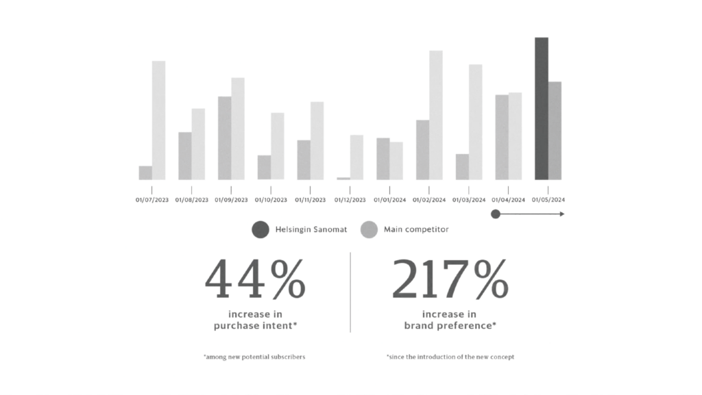
In less than a year, the results spoke for themselves:
Paras visuaalinen design / Paras kampanja
Paras digitaalinen ulkomainos / Paras verkkomainos
